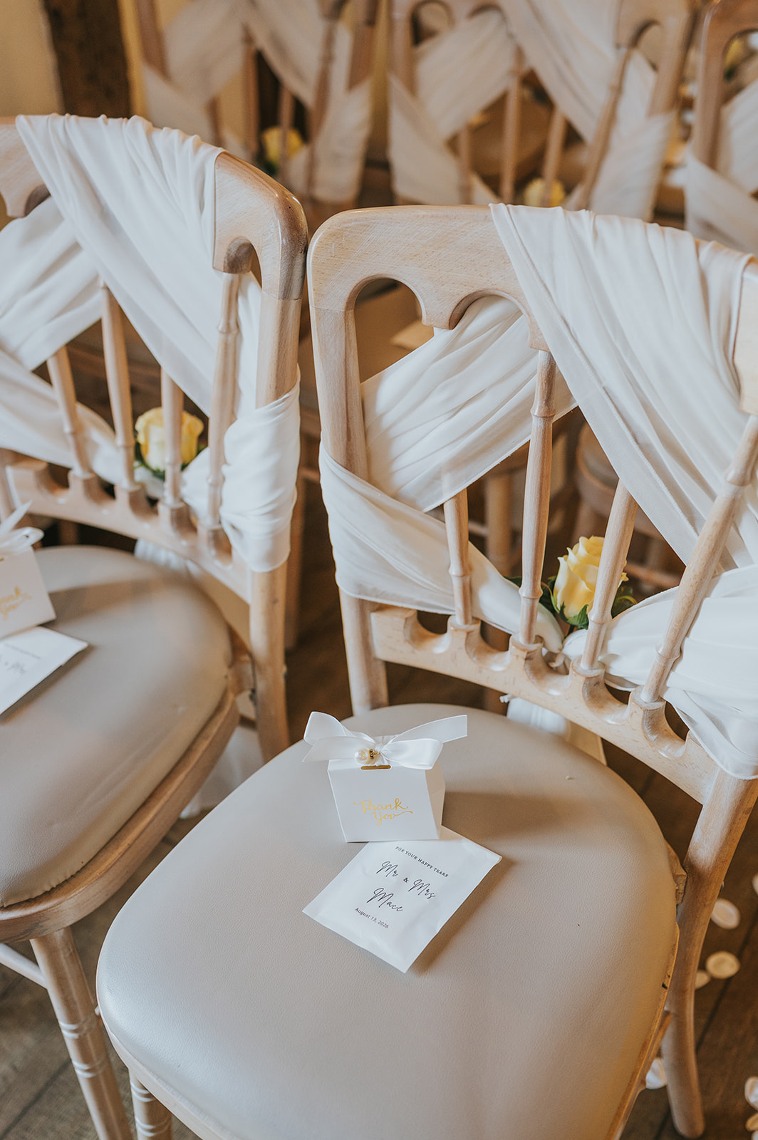
Butter yellow has become one of the most discussed wedding colours heading into 2027 - and it's not hard to see why. Here's how to make it work across your whole day, from flowers and bridesmaids to table styling and stationery.
Why butter yellow is the wedding colour everyone's talking about.
Butter yellow sits in a very specific sweet spot. It's warm without being brash, cheerful without veering into novelty territory, and soft enough to work across every season. It reads differently from the sharper lemons and mustards that have drifted in and out of wedding trends over the past decade. This shade is closer to cream than to sunshine, which is exactly why it photographs so well and pairs with almost anything.
Search interest in butter yellow weddings has grown sharply heading into 2027, and it's easy to see why couples are drawn to it. There's a softness to the palette that feels genuinely considered rather than trend-chasing. It suits a barn in Northumberland just as naturally as a formal country house, and it adapts across seasons without needing a completely different set of flowers or fabrics to do so.
It also carries a quality that's hard to pin down but easy to spot in photographs: it glows. In natural light, butter yellow reflects warmth back into the frame. In golden hour portraits, it practically hums. That's not a coincidence or a happy accident; it's the physics of a colour that sits close to the warm end of the visible spectrum without tipping into orange.
If you're planning a 2027 wedding and you're wondering whether this colour has legs beyond a single trend cycle, the honest answer is yes. Butter yellow belongs to the same family of warm, natural tones that have appeared in interior design, fashion and food for several years running. It's not a flash in the pan. It's a direction.
Flowers that make butter yellow sing in every season.
Flowers are where butter yellow really comes into its own, partly because the shade appears so naturally in the botanical world. You're not asking a florist to dye anything or work against nature; you're working with colours that already exist in abundance.
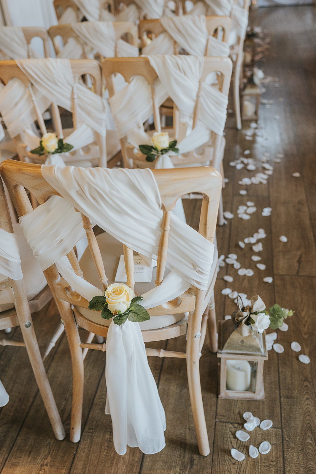
For spring and early summer 2027 weddings, ranunculus are the obvious starting point. They come in a range of creamy yellows that land exactly in butter territory, and their layered petals photograph with a depth that flatter, simpler flowers can't match. Pair them with white or ivory sweet peas, eucalyptus, and a handful of pale blush roses, and you have a palette that feels both fresh and grounded.
For late summer and autumn, the options broaden considerably. Dahlias in soft yellow tones, sunflowers in smaller, more delicate varieties (think Lemon Eclair or Vanilla Ice rather than the giant garden types), and yellow snapdragons all carry the shade well. Dried grasses and pampas, still very much in use for 2027 weddings, complement butter yellow without competing with it.
A few practical notes for your florist brief:
- Be specific about shade. Show your florist reference images. 'Yellow' covers a wide range; butter yellow is a narrow band within that. Canary yellow, ochre and primrose all read differently on camera and in person.
- Think about the full arrangement, not just the bouquet. Table arrangements, ceremony arch flowers and buttonholes all need to feel consistent. A single shade carried through every element reads as intentional rather than coincidental.
- Greenery matters. Sage green, eucalyptus and olive are the best companions for butter yellow. Bright or dark greens can fight with it.
- White and ivory are your neutrals. They keep the palette light and prevent it from feeling heavy or autumnal when that's not the mood you want.
Dressing your bridal party in butter yellow, done right.
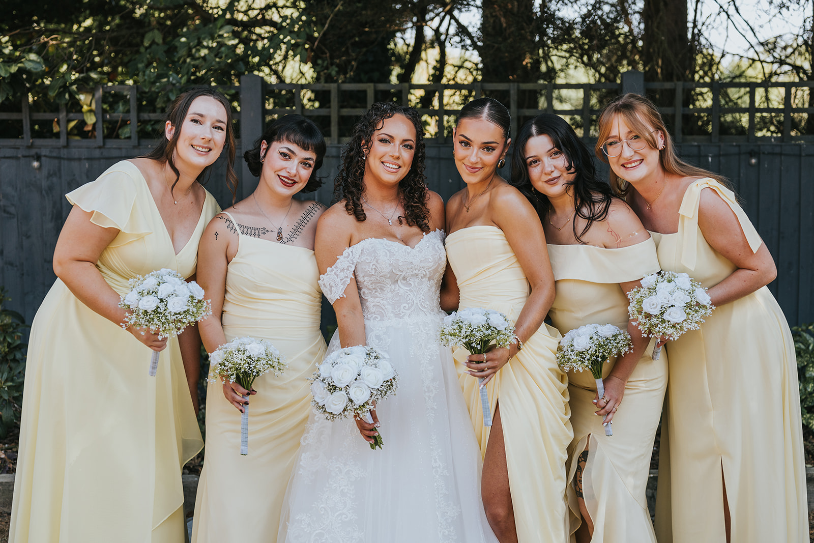
Butter yellow bridesmaid dresses are having a significant moment, and it's one of those trends that looks genuinely good in photographs rather than just good on a mood board. The key is fabric and fit, because this shade behaves very differently in chiffon versus satin versus crepe.
Chiffon and georgette carry butter yellow softly, letting it diffuse in natural light rather than reflecting it harshly. These are the fabrics that photograph with the most warmth and movement, particularly outdoors. Satin can work, but it picks up highlights aggressively, so a full satin butter yellow dress in direct sunlight can shift visually from warm to almost white in photographs. If you love the look of satin, consider a matte or crepe-back satin instead.
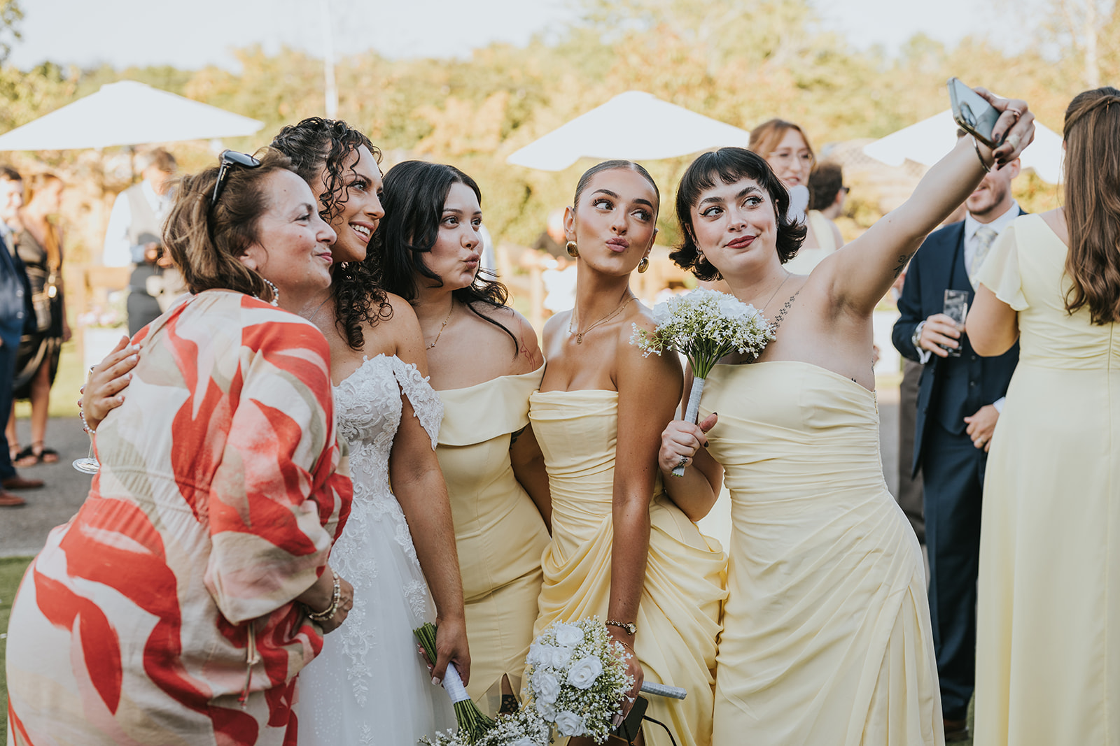
For the wedding party as a whole, butter yellow is forgiving across different skin tones in a way that some cooler pastels simply aren't. The warmth in the shade tends to complement rather than wash out, though it's worth asking your bridal party to hold fabric swatches against their skin in natural light before committing.
Mixing shades within the butter yellow family is a genuine option if you want to avoid a uniform look. A slightly deeper honey tone alongside a softer cream yellow can work beautifully in a relaxed, garden-party setting. The trick is to keep all the tones within the same warm family; introducing a cooler lemon into the mix breaks the cohesion.
For the couple themselves, butter yellow works as an accent rather than a main colour if a full yellow gown or suit feels like too much. A butter yellow sash, pocket square, tie, or floral buttonhole can anchor the palette without requiring a bold commitment.
Table styling and stationery that holds the palette together.
The table is where a colour palette either comes together or falls apart, and butter yellow gives you a lot to work with at the reception. The question is how much of it to use and where.
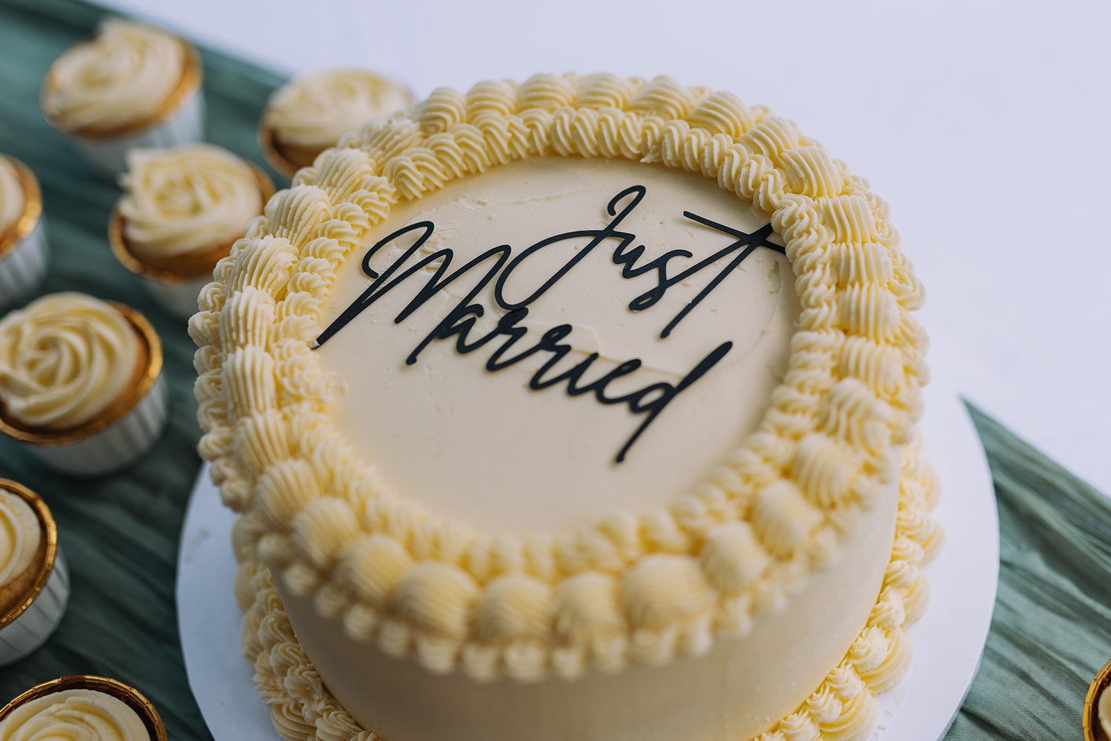
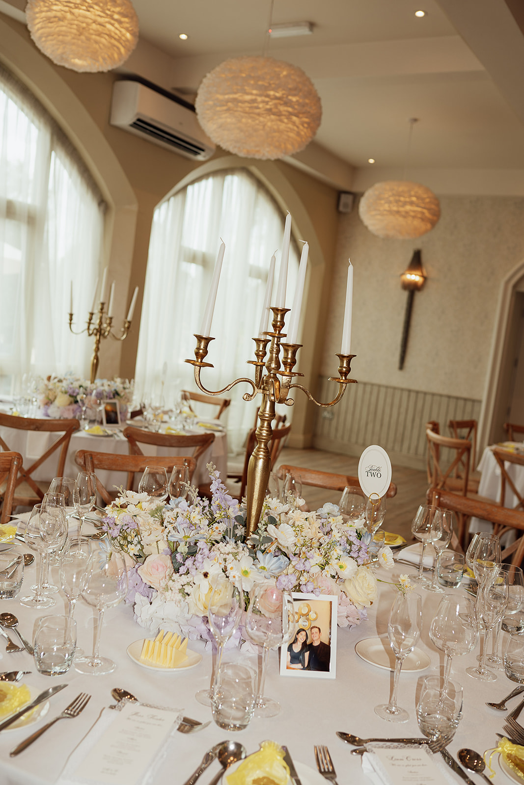
A common approach is to use butter yellow as a mid-layer: white or linen tablecloths as the base, butter yellow in the napkins and floral arrangements, with natural wood, brass, or aged gold in the candleholders and cutlery. This keeps the colour present without making the table feel monochromatic. Brass and gold are particularly good companions because they share the warm undertones of butter yellow without competing with it.
For a bolder approach, butter yellow table runners over white linen work well in venues with high ceilings and good natural light. In darker or more intimate spaces, the colour can feel heavier, so it's worth doing a trial run with your venue stylist or florist if you're considering a more saturated version of the palette.
Stationery is often where couples first commit to a colour, and butter yellow translates very well to print. A few directions that work particularly well:
- Letterpress on cream card with butter yellow ink for an understated, tactile result.
- Watercolour botanical illustrations incorporating yellow florals alongside sage and white.
- Gold foil on white or pale grey card to echo the warm metallic tones in the wider palette.
- Dried flower or pampas grass pressed into wax seals in a complementary tone.
Stationery also sets the expectation for guests before the day, so it's worth ensuring your invitation suite, order of service and place cards feel consistent. A butter yellow palette that runs from the first envelope to the last table card reads as genuinely thought-through.
How butter yellow photographs and what to plan for.
Butter yellow is one of the most camera-friendly wedding colours you can choose, but there are a few things worth knowing before the day so you can make the most of it.
In natural daylight, particularly during the golden hour before sunset, butter yellow absorbs warm light and reflects it back with a softness that richer or cooler colours simply can't match. Portrait sessions in this light with a butter yellow palette tend to produce images that feel warm and cohesive without any heavy editing. If you're planning outdoor portraits, talk to your photographer about timing them for the last hour or two of light; the results in this colour palette are genuinely worth the effort.
In overcast or flat light, butter yellow holds its warmth better than you might expect. It doesn't grey out the way some cooler pastels do, which makes it a reliable choice for UK weddings where guaranteed sunshine is, to put it diplomatically, an optimistic assumption.
A few practical things to think through with your photography and videography team ahead of the day:
- White balance matters. Butter yellow sits close to warm white on some camera sensors, so a well-calibrated white balance setting ensures it reads as yellow rather than cream in the final images. This is a technical detail, but it's worth mentioning when you brief your team.
- Backgrounds. Butter yellow pops against dark foliage, stone walls, and aged brick. It can get lost against very light or pale backgrounds. If your venue has a mix of settings, a short conversation about which spots will show the palette at its best is time well spent.
- Film. On video, butter yellow carries warmth through movement in a way that still images can't fully replicate. It's particularly effective in slow-motion footage and in reception coverage where the colour appears across the whole scene.
We cover both photography and film for weddings across the UK, and butter yellow is a palette we're genuinely excited to work with in 2027 if you'd like to talk through what that looks like for your day.
Building a full butter yellow palette without overcomplicating it.
The most common mistake with any statement colour is using too much of it. Butter yellow works best as the warm anchor of a wider palette, not as every surface in the room. A good working rule: let it appear in three or four distinct elements (flowers, napkins, bridesmaids, stationery) and let everything else play a supporting role.
The palettes that tend to work best alongside butter yellow in 2027 are:
- Butter yellow, sage green, and ivory for a soft, garden-inspired feel that works across spring and summer venues.
- Butter yellow, terracotta, and warm white for a late summer or early autumn wedding with a slightly earthier mood.
- Butter yellow, dusty blue, and cream for something with a little more contrast; the cool blue offsets the warmth of the yellow without fighting it.
- Butter yellow, champagne, and brass for a more formal or candlelit setting where you want the palette to feel rich rather than rustic.
When you're briefing suppliers, consistency is everything. Your florist, stationer, cake designer and venue stylist don't automatically talk to each other, so you need to be the person holding the thread. A simple reference image folder shared across all your suppliers saves a significant amount of back-and-forth and prevents the kind of small shade variations that only become visible when everything is in the same room on the same day.
Butter yellow also travels well across different venue types, which is worth noting if you're still deciding on a location. It suits the pale stone of a country house, the exposed beams of a barn, the white walls of a coastal venue, and the greenery of a garden marquee. It's a colour that's confident enough to hold its own without demanding a particular backdrop.
If you're planning for 2027, you're making decisions now about suppliers, colour references and overall palette direction. Butter yellow rewards early planning, partly because the best florists and stylists working in this colour are already getting enquiries for next year, and partly because getting the shade exactly right takes a conversation or two rather than a single email.
Quick wins
- NAIL THE SHADE: Butter yellow is a specific, narrow tone. Share reference images with every supplier rather than describing it verbally; 'yellow' covers far too much ground.
- ANCHOR IT WITH THREE ELEMENTS: Use butter yellow in three or four distinct places (flowers, napkins, bridesmaids, stationery) and let neutral tones carry everything else.
- CHOOSE WARM COMPANIONS: Sage green, ivory, brass, and terracotta all sit in the same warm family as butter yellow. Avoid cool whites or sharp greens, which can make the palette feel disconnected.
- TIME YOUR PORTRAITS: Golden hour and butter yellow are a very good combination. Talk to your photographer about scheduling outdoor portraits in the last hour of light.
Frequently Asked Questions
Does butter yellow work for a winter wedding?
It can, though it works harder in winter than it does in spring or summer. In a candlelit venue, butter yellow elements on the table reflect warm light beautifully. Outdoors in grey winter light, the palette can feel a little muted, so lean into rich companions like terracotta, deep green, or brass to keep it feeling intentional rather than washed out.
What skin tones does butter yellow suit for bridesmaids?
Butter yellow's warm undertone tends to be flattering across a range of skin tones, more so than cooler or sharper yellows. It's still worth testing fabric swatches in natural light before committing, particularly if your bridal party has a wide range of tones, as the exact shade of the fabric can shift the result considerably.
What flowers come in butter yellow?
Ranunculus, garden roses, dahlias, snapdragons, and smaller sunflower varieties (such as Lemon Eclair) all come in shades that land in butter yellow territory. Your florist may also suggest spray chrysanthemums or freesias depending on the season. Always show your florist a colour reference image rather than relying on a verbal description.
Is butter yellow too trendy to use if I want timeless photos?
Butter yellow sits close enough to neutral and natural tones that it reads as warm and considered rather than obviously trend-driven in photographs. It's a very different risk from, say, an aggressively bold or novelty colour. If you're drawn to it, use it; the photographs from a well-executed butter yellow palette tend to age well.
For a practical next step, explore our wedding planning guide.