Choosing your wedding colour palette is one of the most fun parts of planning. It’s also one of the easiest places to overthink it.
Spring gives you a head start. The light is softer, the greens are fresh, and the flowers are already doing half the work. The trick is picking colours that suit your venue, your style, and the vibe you want for the day.
Here’s how to choose your spring wedding colours, plus five palettes that look as good in real life as they do on a mood board.
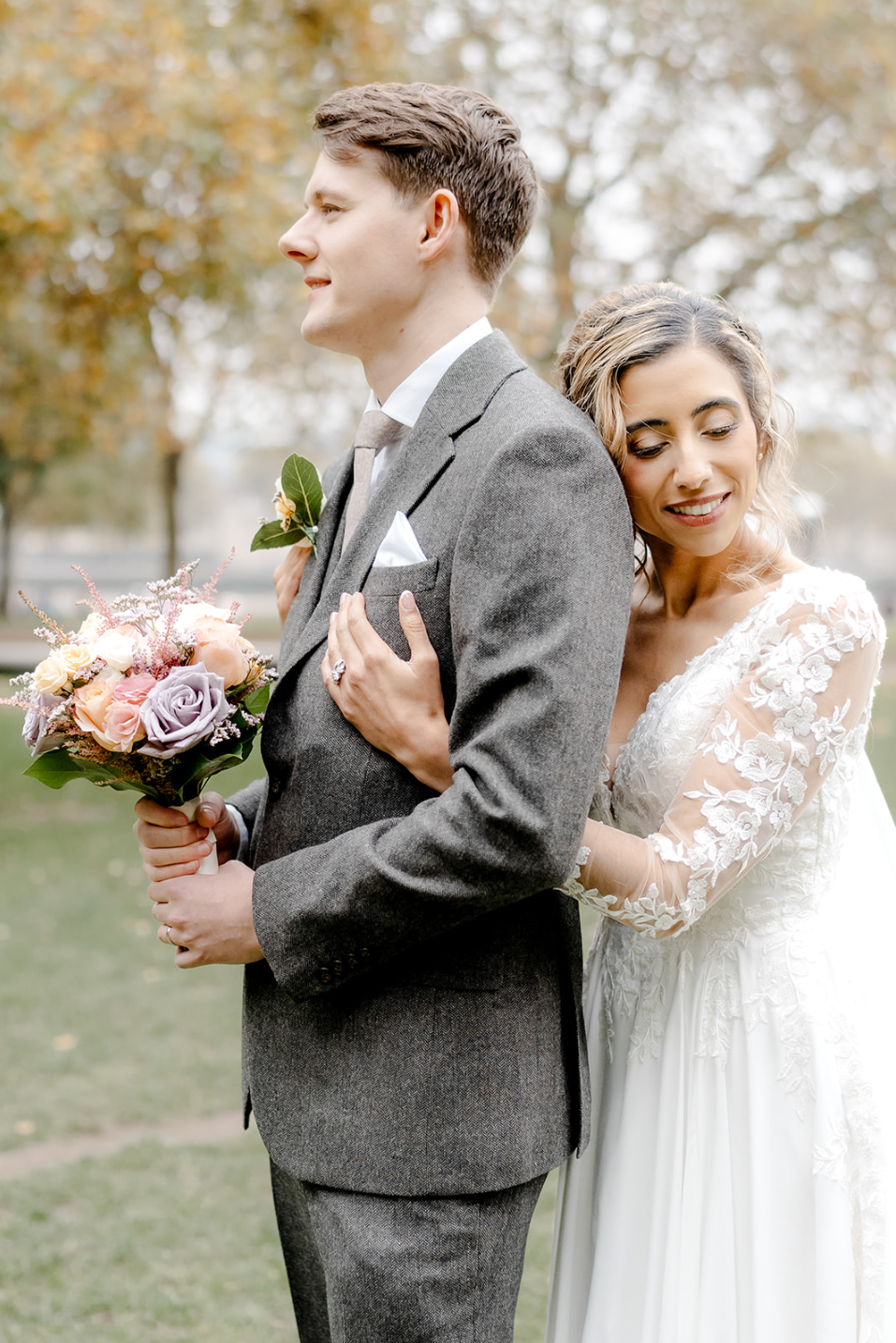
Start with the vibe, not the colour
Before you go down a Pinterest rabbit hole, ask yourself a few questions:
- Are you going for formal or relaxed?
- Inside, outside, or both?
- Modern, boho, romantic, classic, or playful?
If you want something formal or modern, go bolder: raspberry, coral, turquoise, deep purple.
For outdoor and garden weddings, softer shades blend with the surroundings: blush, powder blue, sage, lavender.
When your colours match the mood you’re going for, everything feels intentional.

Think about your dress
If you’re wearing classic white or ivory, you’ve got total flexibility. But if your dress has a hint of colour (blush, mocha, blue, floral details) it’s worth echoing those shades in your flowers, bridesmaids, and stationery. It creates a cohesive look without trying too hard.
Pick one main colour, then build around it
The simplest approach:
- Choose your primary colour: The one you keep coming back to. Bold or soft, it doesn’t matter.
- Add 2-3 accent colours: Shades that complement without competing.
- Consider metallics: Gold, champagne, or copper add warmth and a bit of polish.
- Keep it cohesive: Repeat the palette through flowers, attire, stationery, and table styling.

5 spring wedding colour palettes worth stealing
1. Blush pink and sage green
A springtime classic. Romantic, calming, and works in almost any setting.
Blush looks gorgeous in bouquets, bridesmaid dresses, and glassware. Sage comes through in garlands, table runners, and archways. This palette is made for garden weddings or anyone who wants something soft and natural.
2. Dusty blue and lavender
Dreamy and serene. This one works beautifully in rustic barns, countryside venues, and boho celebrations.
Lavender doubles as a flower too, so you can use it in crowns, favours, or wildflower arrangements. Pair with blue glassware and natural textures for a relaxed, pulled-together feel.

3. Coral and peach
Cheerful and full of life. Coral brings the energy, peach softens it. Add pops of pink or orange for a playful twist.
This palette works best at beach weddings, garden parties, and outdoor venues with plenty of sunshine. And it looks fantastic in florals and desserts.
4. Mint green and yellow
Fresh, fun, and a bit vintage. Mint is lively, yellow is sunny, and together they create something joyful.
Think mint-lemon cocktails, gold accents in the stationery, and colourful umbrellas if the British weather shows up. This is a palette for couples who don’t take themselves too seriously.
5. Navy blue and dusty rose
If you’re planning something more formal, this is a winning combination. Navy adds depth and a bit of drama. Dusty rose brings warmth and romance.
Navy for suits and table linens, dusty rose for flowers and accessories. It’s classic, it’s elegant, and it photographs really well.

Let the season do the work
Spring already gives you a beautiful backdrop: blooming flowers, fresh greenery, soft light. You don’t need to overcomplicate it.
And don’t forget personal touches. Your birth flower, a colour that means something to you both, or a shade from a favourite place. Those details make a palette feel yours, not just pretty.
Common questions
Should I match my stationery to my colour palette?
Yes. Your invitations are the first glimpse guests get of your wedding style. Carrying the palette through to paper colour, fonts, or envelope liners makes everything feel cohesive from the start.
Can I mix different shades of the same colour?
Absolutely. Using multiple shades of one colour (like various pinks or greens) adds depth and makes it easier to coordinate flowers, attire, and decor. It looks curated rather than matchy.
How do I include my partner’s preferences?
Sit down together and talk about colours you both love (and ones you don’t). Think about meaningful shades: a colour from your first holiday together, or somewhere you love. Blending both your tastes makes the palette feel more personal.

Make it yours
Whether you go for soft pastels, bold pops, or elegant neutrals, the right colour palette ties your whole day together.
If you want photos and films that capture your colours exactly as they looked on the day, check your date with us. We’d love to be part of it.